Product
Product Grid
A responsive grid of product cards with built-in loading skeletons and a customizable empty state.
grid
responsive
loading
Preview
new
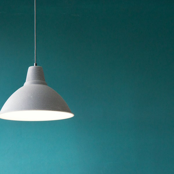
Aurora Lamp
$129.00$179.00-28%

Halo Chair
$249.00
Installation
Run the shadcn CLI. Dependencies and the shared lib block come with it.
npx shadcn add product-gridUsage
Import
import { ProductGrid } from "@/components/lumo/product-grid"Example
<ProductGrid
  products={products}
  columns={3}
  onAddToCart={(product, variant) => addLine(product, variant)}
/>
Props
| Prop | Type | Default | Required |
|---|---|---|---|
| products | Product[] | - | Required |
| loading | boolean | - | |
| loadingCount | number | - | |
| columns | 2 | 3 | 4 | 4 | |
| emptyState | ReactNode | - | |
| onAddToCart | (product, variant) => void | - | |
| isInWishlist | (product) => boolean | - | |
| locale | string | - |
All props accept standard HTML attributes unless otherwise specified.
Dependencies
Lumo blocks
- lib
- Product Card
Own every line
Lumo blocks copy into your repo. No runtime dependency, no lock-in. Edit the code to fit your product.